Baby Blue and White, Done Right
** This post contains affiliate links and I will be compensated if you make a purchase after clicking on my links
Everything we do has purpose and meaning, from the traditions within our processes to the letters on our chests. As members of culturally based organizations, we stress the importance of only putting our Greek letters on our organizational colors (and sometimes black).
Such intentional planning differentiates us from our Panhellenic and Interfraternity counterparts. In these organizations, Greek letters can be placed on colors of varying shades and hues, whether or not they reflect the organization’s colors. This allows them to create shirts as a collective council, with all of their Greek letters represented on the shirt regardless of color. On the other hand, it reduces the specialness of the organization’s color. Such leniency concerning how Greek letters are portrayed is neither better nor worse than the stricter guidelines followed by culturally based organizations, it is simply a different method of execution.
One thing I do appreciate about strictly sticking to baby blue and white, in terms of Mu Sigma Upsilon Sorority, Incorporated, is that it clearly creates a brand. What I mean is that people know what organization I am from simply by looking at me and seeing baby blue and white, without even needing to see my letters. When I walk around campus in my crossing jacket, people know I am a sister of MSU. There is no question or ambiguity associated with my identity because of my consistent representation of baby blue and white. In comparison, I frankly have no idea what the colors of the Panhellenic and Interfraternity organizations on campus are–simply because they always wear letters on shirts of varying hue.
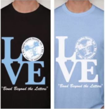
Still, I respect that allowing leniency in terms of Greek lettering may help unify the Panhellenic and Interfraternity councils by allowing them to cosponsor events and have their letters on the same shirt. For MSU as well, paraphernalia is continually evolving from the traditional apparel like crossing jackets and chapter shirts. Varying chapters are designing logos, catch phrases, and images that are being printed and displayed to create fun new para. For example, a sister from the Yemaya chapter recently designed a creative shirt incorporating some lyrics from a popular song. Similarly, the Genesis chapter has developed LOVE T-shirts that some sisters have enjoyed repping.
Having the opportunity to represent our organization in creative ways is still an option for us, even if our letters stay solely on baby blue and white backgrounds.


If you have a creative idea you’d like to put to work, check out the link here!
Blog Post By: Djenne Dickens, Yemaya Chapter


There are no comments